Natural Resources Conservation Service
Overview
The Natural Resources Conservation Service (NRCS) is a government agency that is dedicated to delivering conservation solutions so agricultural producers can protect natural resources. The website provides information to farmers, ranchers, and forest landowners on ways to apply for grants, programs, and other investments to conserve natural resources on their private lands.
For this project, we sought to:
-
Modernize the NRCS website using USWDS as guidance while keeping the integrity of the agency intact.
-
Streamline information architecture that focuses on user needs and top tasks.
-
Improve page structure and user experience by reducing cognitive load and creating reusable UI components.
Role
sketching, wireframing, visual design, prototyping, interaction design
Timeline
Nov 2021 - Oct 2022
Tools
Figma, Mural, pencil & paper
The Challenge
Deliver customer-focused, easy-to-navigate, and user-friendly content that makes farmers, ranchers, landowners, and government agencies feel excited and informed because they can successfully sign up for programs, find contacts, and access data.
Discovery
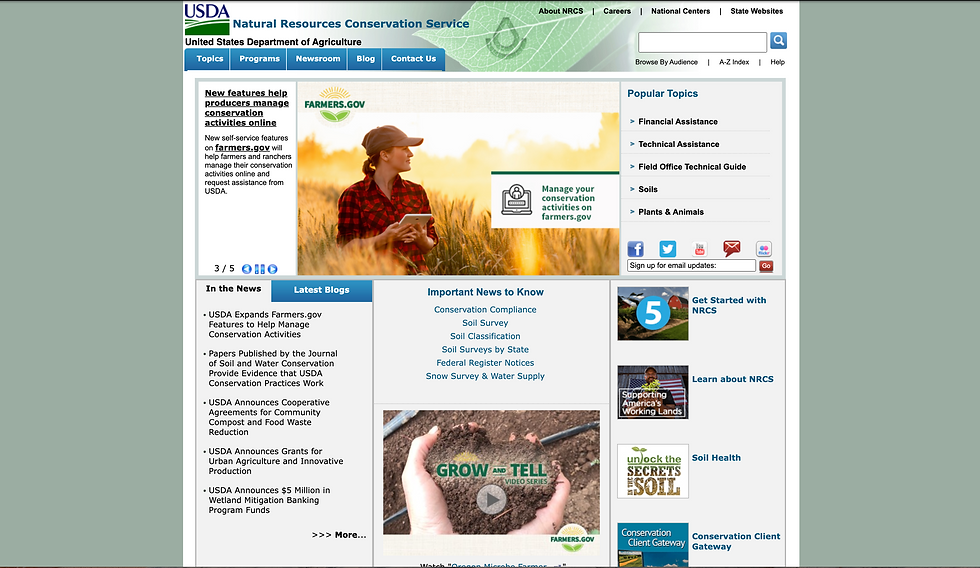
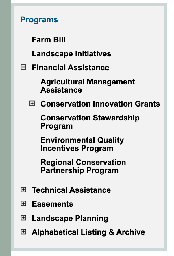
The legacy NRCS site housed massive amounts of information, so there were hundreds of pages to go through and an overwhelming IA to become acquainted with. To start acquainting myself with the site, I spent time browsing the NRCS website, noting possible improvements, and documenting the current information architecture. From previous discovery work, we learned that many of our stakeholders found the IA to be unintuitive, rigged, and requiring too many clicks. This key takeaway provided the basis of our new proposed IA and sitemap.
NRCS Stakeholder
"There needs to be some SOPs or process to make sure all the work that goes into the site isn't cluttered up and undermined by stale content. If you go to the site, every other page there's something outdated."
NRCS Stakeholder
"If you go to different state sites, the architecture is so rigged that there's a lot of dead ends in a lot of places. You go to places thinking there's content and there's just not."
User 1
"I do think there's a lot of duplication either with our page or the national page - why should I post on the Montana site if it exists someplace else already?"
NRCS Stakeholder
“The design... it's just very compartmentalized. I don't really know where to look... there is no hero image to grab attention. You come to the page and you're not sure what to do."
Navigation & Sitemap
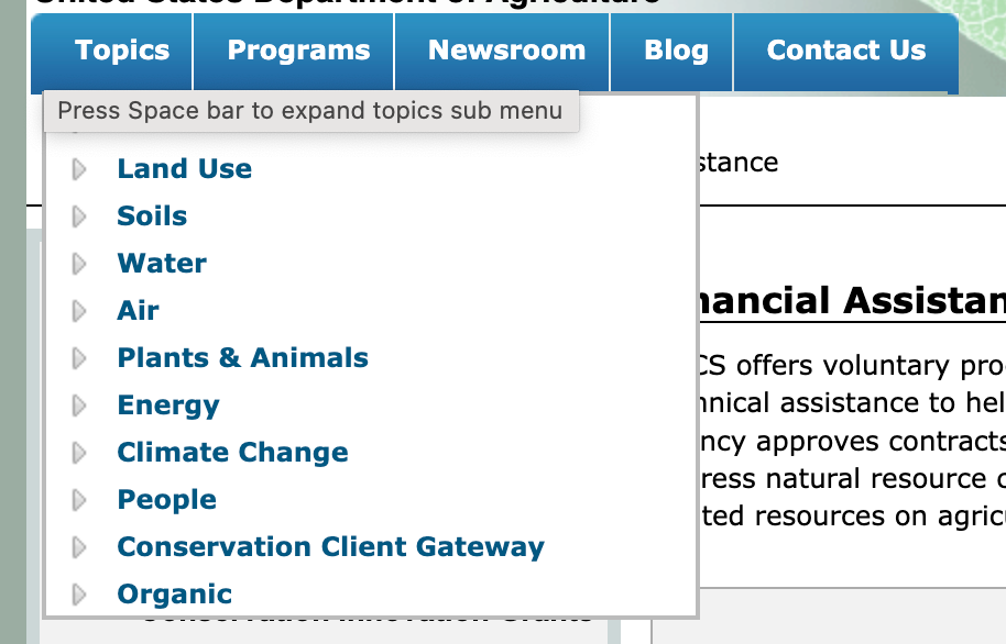
We opted to begin with the navigation because it allowed the client to visually see what the hierarchy looked like and to establish trust with them. The team used a megamenu-style navigation to ensure that all relevant pages could easily be accessed and to set up a clear hierarchy of content. I primarily focused on the UI design within the megamenu by using design best practices and psychology to create a pleasing experience.
There were several back-and-forth conversations with the client about what items should be displayed within the megamenu. They wanted to add several more items to both the top navigation bar and the tertiary elements in order to mirror their current site. However, we were able to come to a compromise to allow up to 6 programs to be displayed in each section with a link to view all on another page. This allowed for some customization while keeping information overload and decision fatigue to a minimum.

Homepage Design
The first page the design team began ideating on was the homepage. In our design process with the USDA, we begin with a homepage design to set expectations with the client and give a “sneak peek” of our design skills.
For the NRCS homepage, our goal was to create a first (and lasting) impression with the user and encourage them to dig deeper into the site. Instead of putting all of the content above the fold, like in the legacy design, I used the Gestalt principles of proximity and closure to guide the user’s eye down the page and tell a story. Then, we explored color palettes and component styles within USWDS to create a unique identity and brand for NRCS. We selected photos featuring people from our user group to inspire trust and comfort by adding a human element to the site.
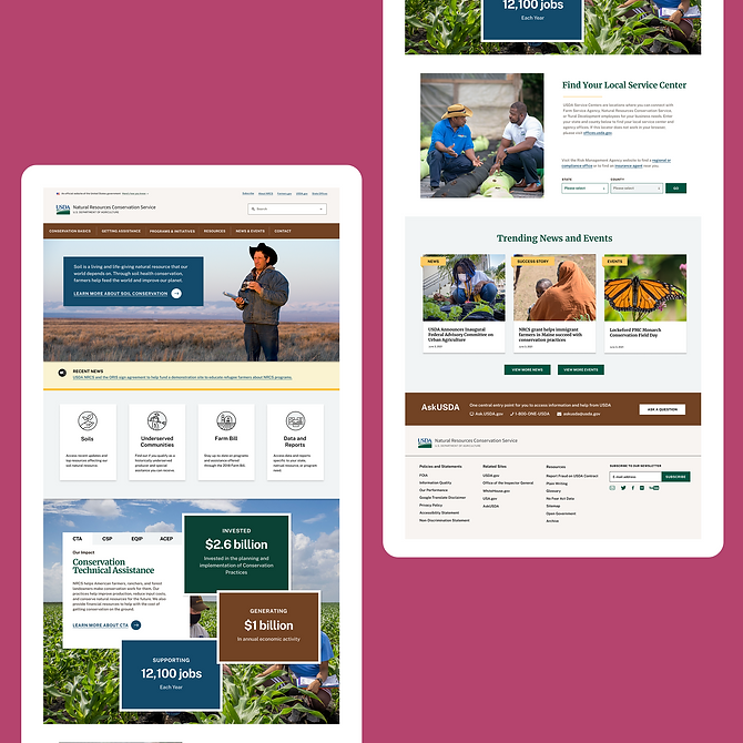
Page Structure & Components
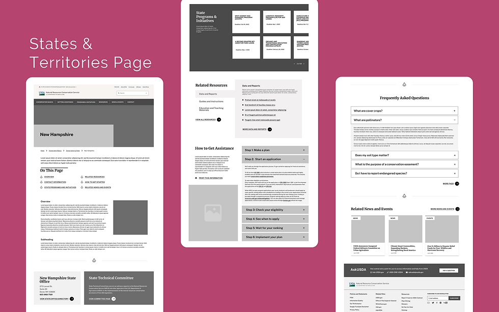
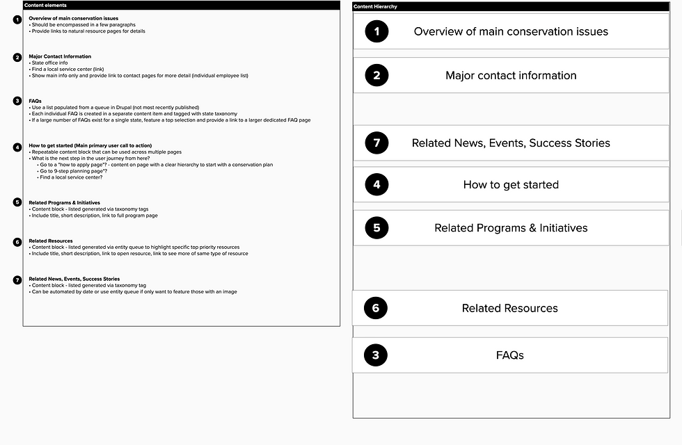
We worked closely with our content strategist to determine which pages from the NRCS site to start wireframing. These would cover all of the content types scattered across the site. We designed 6 different screens to act as templates for the content managers to use when they create their pages. In addition to the screen, we also created reusable components to make it easier for them to create engaging and valuable pages. These components would help provide structure and a clear visual hierarchy to the page instead of a page full of links and large bodies of text.

We conducted a content workshop in Mural with our stakeholders to give us insight into what information to prioritize on the page. Since one of our goals was to reduce the number of pages on the NRCS website, our solution was to create more content-rich pages that would inevitably result in longer pages with information residing below the fold.
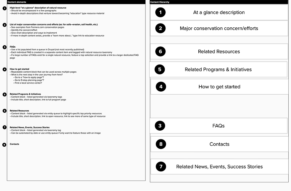
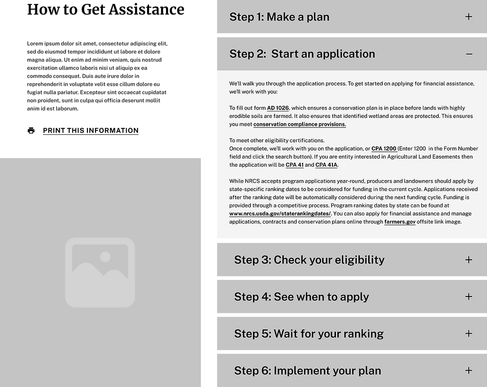
Wireframes
With the large amount of content needed on each page, we decided that the pages needed to have an easy way to navigate down the page to the section related to their goal. We created an anchor link component, stylized with the NRCS logo.